.png)
.svg)


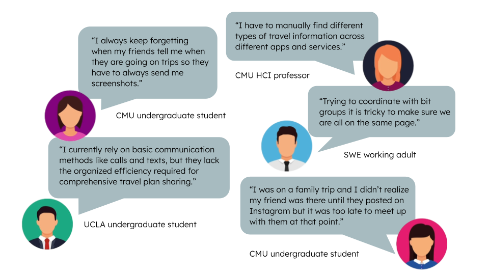
Through interviews with students, professionals, and academics, we uncovered a consistent pain point: coordinating travel plans with others is fragmented, inefficient, and often leads to missed connections. Users rely on scattered tools such as texts, screenshots, calendars, and social media, to share or track travel plans, resulting in forgotten dates, lack of real-time updates, and missed opportunities to meet. Whether it’s forgetting a friend’s trip, struggling to align group schedules, or finding out someone was nearby too late, users expressed a clear need for a centralized, lightweight, and private way to coordinate travel with their personal networks.
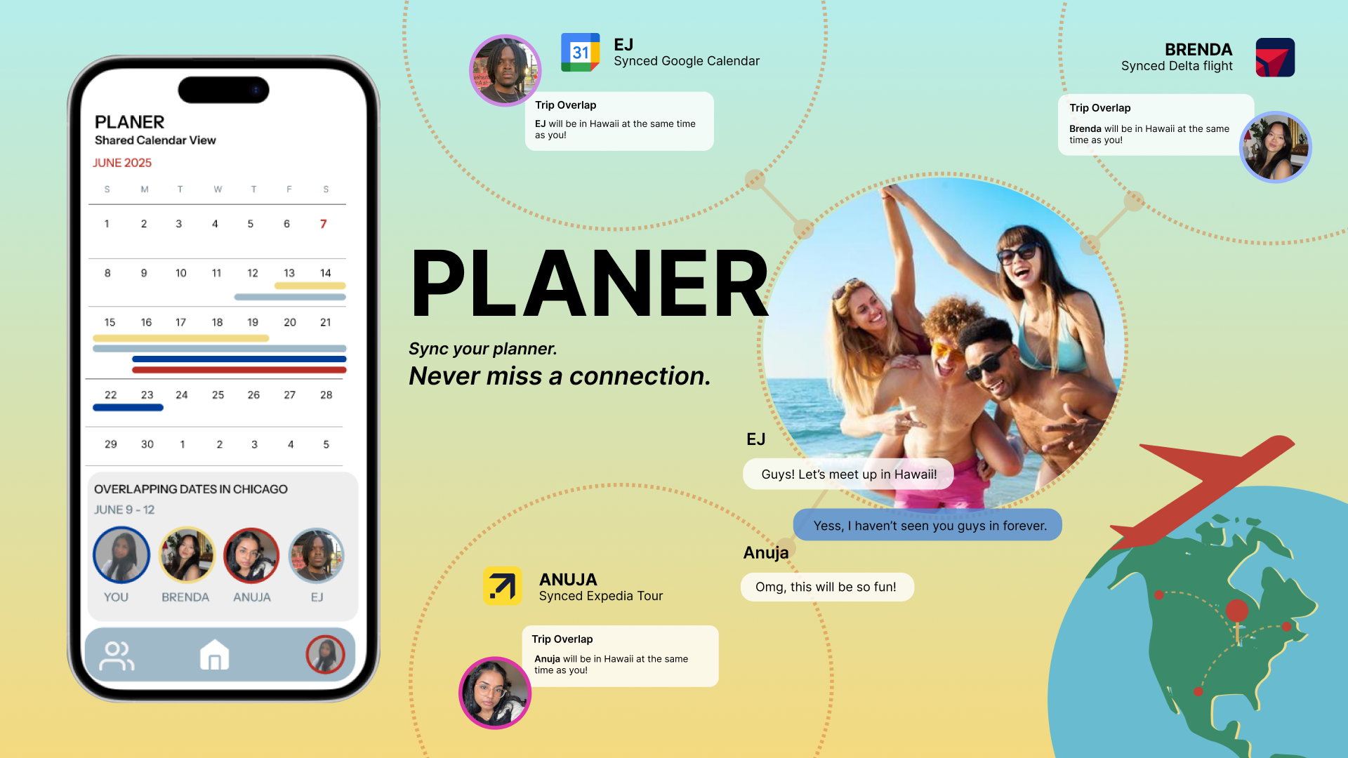
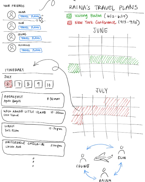
Our MVP began as a shared calendar concept, allowing users to log travel plans and view their friends’ trips in one place. We focused on visual clarity by incorporating features like color coding, a monthly view, and the option for a more detailed daily view. Initially, we assumed users would prefer a calendar layout and introduced a friends list tab to toggle visibility. Early versions used subtle dots to indicate overlapping trips, but usability testing showed these were often overlooked. In response, we redesigned the interface with bold overlap bars and added friends’ profile photos directly on shared dates, making trip overlaps more visible and connections easier to recognize.
.JPG)

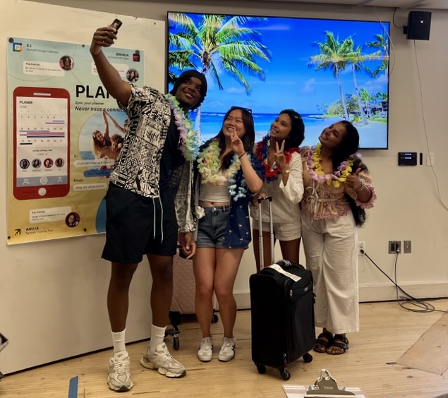
The outcome of presenting Planer to investors, faculty, and students was highly constructive and insightful. Our pitch effectively communicated the core value of the product, simplifying travel coordination through a clear, intuitive interface. Investors appreciated the focused MVP and saw potential in its niche approach to social travel planning. Faculty feedback highlighted the strength of our user-centered design process and encouraged further refinement of the value proposition. Students responded positively to the idea, expressing interest in using the platform for their own travel coordination. Overall, the presentation validated our concept, revealed opportunities for improvement, and reinforced the demand for a tool that fosters meaningful, low-effort travel connections.
Identified a specific need and shaped the product around how users actually want to connect.
Iterative Design & MVP Mindset
Embraced rapid prototyping and testing, starting with a basic MVP and improving it through user feedback, proving the value of building lean and learning fast.