Full-Stack Website Redesign & Development
Modernizing a Historic Pittsburgh Landmark’s Online Presence with User-Centered Design and Interactive Features
Product Designer &
Front/Back-End Developer
HTML, CSS, JavaScript,
Figma, Visual Design
Individual
4 weeks (Spring 2025)
BACKGROUND
Project Overview
The Duquesne Incline, a historic cable car system operating since 1877, is a beloved Pittsburgh landmark famous for its stunning city views and rich history. To enhance the visitor experience and boost engagement, the client requested a complete website redesign emphasizing modern web standards, improved usability, accessibility, and interactive content.
PROBLEM
Why Redesign this Website?
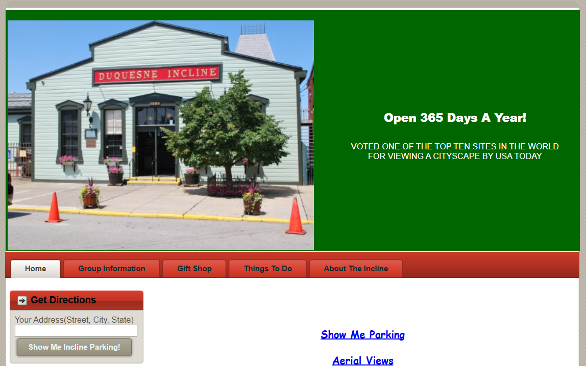
The Duquesne Incline had an outdated website that suffered from poor usability, minimal interactivity, and a limited content structure. Visitors often struggled to find basic information such as operating hours, and the site failed to convey the rich history and full experience of the Incline. Despite being a popular tourist attraction, the website’s navigation was confusing, important details were hard to locate, and its visual design did not reflect the unique heritage of this iconic landmark.
GOAL
A Modern, User-Centered Solution
I adopted a mobile-first, user-centered design approach grounded in research, prototyping, and iterative testing. The website redesign focused on modernizing the UI/UX and visual branding, improving navigation and information architecture, and delivering engaging historical and visitor content. Additionally, we ensured the site met accessibility best practices, incorporated interactive features including a fully functional contact form, and prepared comprehensive, developer-ready documentation for a seamless handoff.
USER INTERVIEWS
Understanding the User Base
I conducted interviews with users who completed key tasks on the website while sharing their thoughts out loud. The feedback highlighted the need for clearer navigation and more prominent display of essential information like hours and ticket prices. I used these insights to improve the site’s information hierarchy, navigation, and form visibility, reinforcing the value of user-centered design and testing.
PROCESS
My Approach & Key Deliverables
Research & Analysis
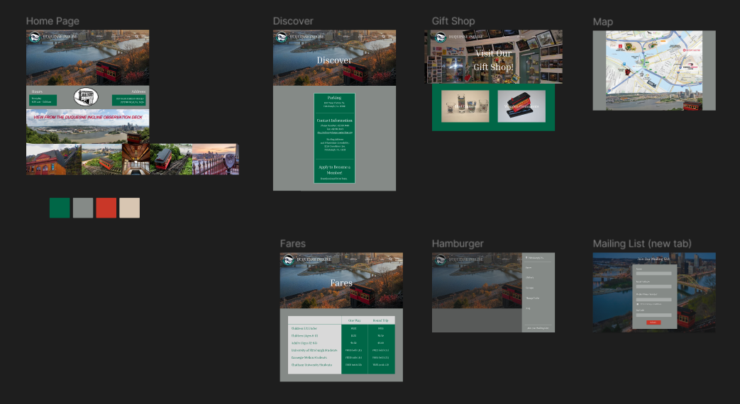
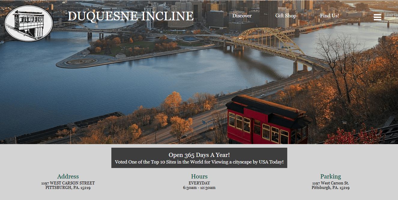
Redesigned the sitemap to prioritize essential info like hours, tickets, and location. Simplified navigation labels to match user expectations.
%20-%20Copy.png)
Information Architecture
%20-%20Copy.png)
%20-%20Copy%20-%20Copy.png)
%20-%20Copy%20-%20Copy.png)
Design & Development
Reviewed similar tourist attraction sites and conducted user interviews. Key pain points included poor navigation, hidden hours, and mobile usability issues. Aligned project goals with client-provided assets and requirements.
Coded the site from scratch using HTML, CSS, JavaScript, and jQuery. Added dynamic features like an accordion, image carousel, contact form with validation, and embedded Google Map.
Passed W3C validation and ensured keyboard accessibility, proper heading structure, and descriptive alt text.
Built high-fidelity wireframes in Figma using real content and branding. Focused on accessibility with proper color contrast, readable fonts, and alt text.
Wireframing
Usability Testing
Accessibility & Compliance
.png)
User feedback led to improved navigation, better content visibility, and layout refinements.
%20-%20Copy.png)
SOLUTION
A User-Friendly and Accessible Web Experience
I redesigned and developed a modern, user-friendly website for the Duquesne Incline that improves navigation, accessibility, and visual appeal. Key visitor info like hours and fares was reorganized for easy access, and the site was built from scratch using HTML, CSS, JavaScript, and jQuery. I added interactive elements like a photo carousel, Google Maps embed, and a validated contact form. High-fidelity wireframes guided the design, and usability testing informed key updates. The final site delivers a clean, accessible experience that reflects the Incline’s historic identity while meeting modern user expectations.
REFLECTION
Delivering Real-World Results
I created a developer-ready website that enhances user experience and visual branding, incorporating advanced interactive elements.
Enhanced Accessibility
Simplified navigation and reorganized content made it easier for users to find essential information quickly.
Integration of dynamic elements such as a photo carousel, Google Maps, and a validated contact form increased user engagement.
Interactive Features
User-Centered Design
Usability testing provided valuable feedback that guided refinements, resulting in a polished, user-friendly final product.
Improved Usability
Implementation of web accessibility best practices ensured the site is inclusive and usable for all visitors.
.png)
.svg)

.png)